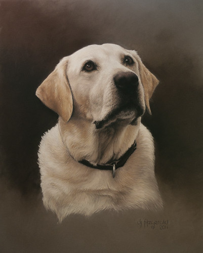
pastel on clairefontaine pastelmat
private collection
actual size 16"X20"
www.djfitzgerald.com
A christmas gift commission... safe to post now! I did not get to take these photos.... fortunately the client is a very good photographer. But I still ended up using 2 photos to get what I wanted. The main photo of Ringo's face did not have much chest on it... so I took it from a different photo. The only other thing I did was to leave off his dog tags and just the tip of his tongue was peeking out. This is also one of the first pastels of this sort that I have done on the Clairefontaine Pastelmat. That is, leaving the paper color for the background. I did add some burnt umber and black to give the portrait some depth and to really make Ringo pop out. I am very happy with the way this one came out and so were the clients! Always a good thing!

Monday, December 26, 2011
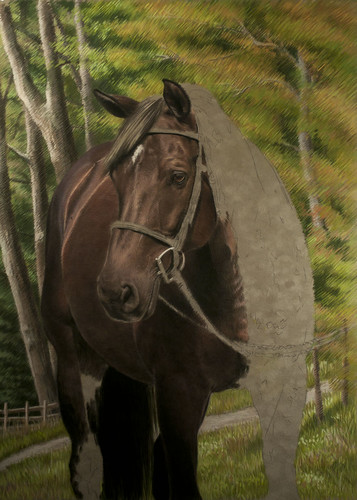
Friday, December 23, 2011
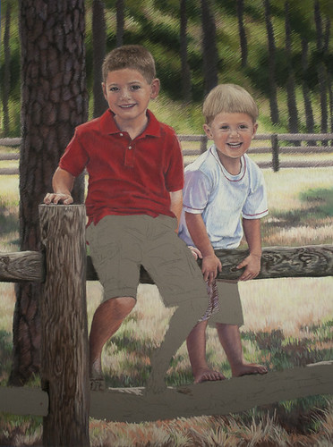
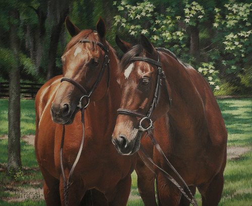
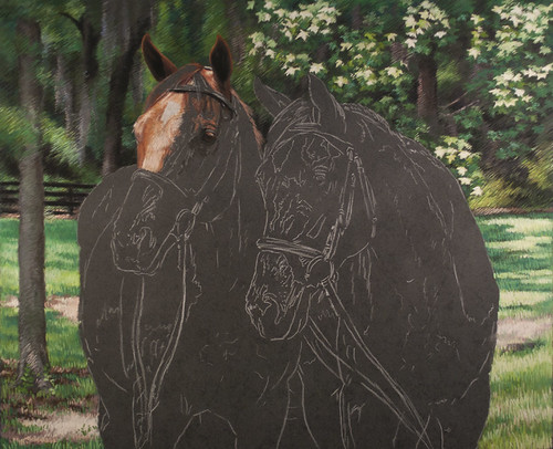
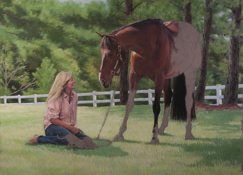
Garrett & Jacob Pastel #8
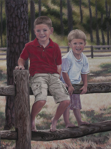
pastel on clairefontaine pastelmat
private collection
actual size 19"X26"
http://www.djfitzgerald.com
DONE!
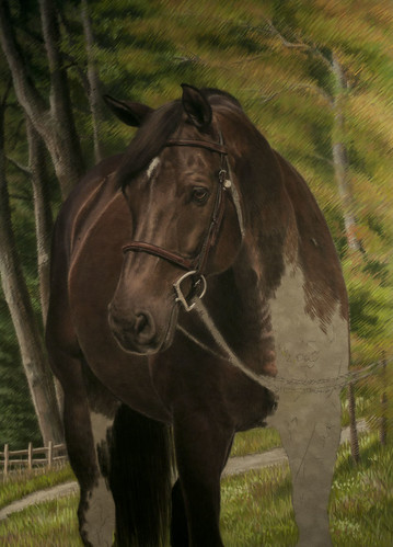
Thursday, December 22, 2011
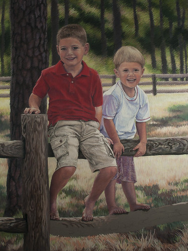
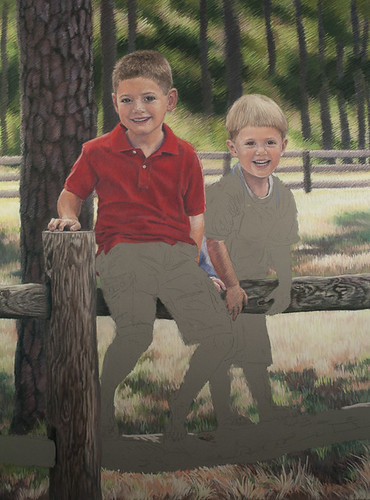
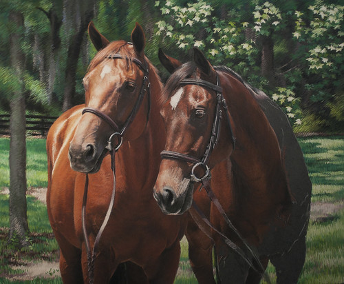
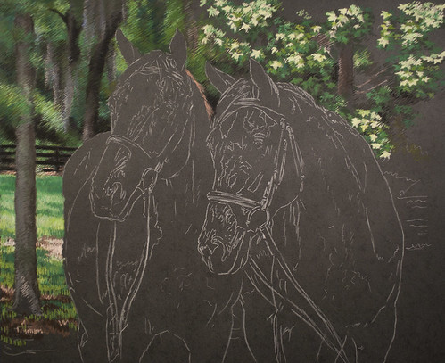
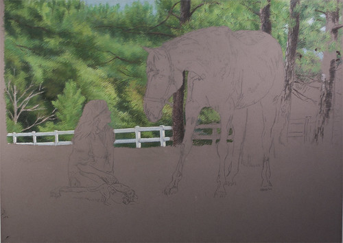
Garrett & Jacob Portrait #7

pastel on clairefontaine pastelmat
private collection
actual size 19"X26"
http://www.djfitzgerald.com
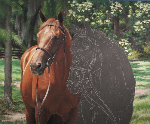
O.K. I "think" I'm done.. will probably tweak Garrett a little more. I really love the way this one came out! I especially love the grass and wood... it felt a little closer to painting on this surface. Although I do see that I really have to plan what I am going to do... the surface does not take well to erasing... it is possible but you lose the freshness when you do. And I really have to plan on where I am going to put my signature!! I did not think about that until I was about to do it! When working on velour or suede, I would do my signature in a felt tipped art pen... can't do that here! And with this piece I had the fence to deal with. The only place to put it was in the right hand corner and I had a shadow there that I really liked! So I ended up doing it in a lighter colored pastel in the shadow. I think it looks alright... I am having it scanned for the client so she can do christmas cards and some small giclees done for gifts.
Sunday, December 18, 2011
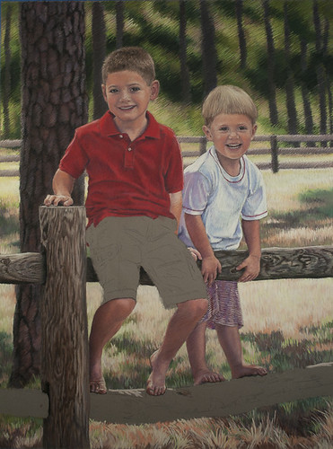
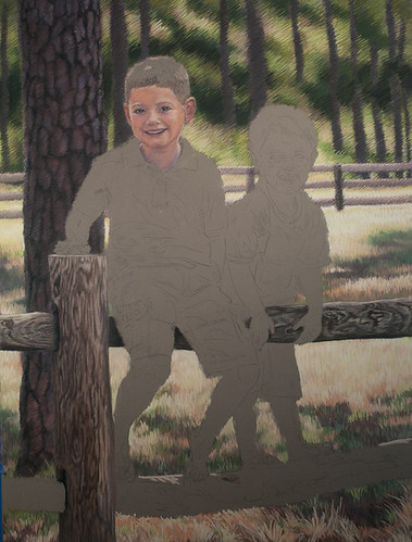
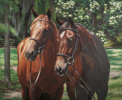
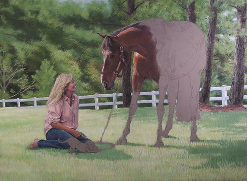
Garrett & Jacob Portrait #6
pastel on clairefontaine pastelmat
private collection
actual size 19"X26"
http:www.djfitzgerald.com
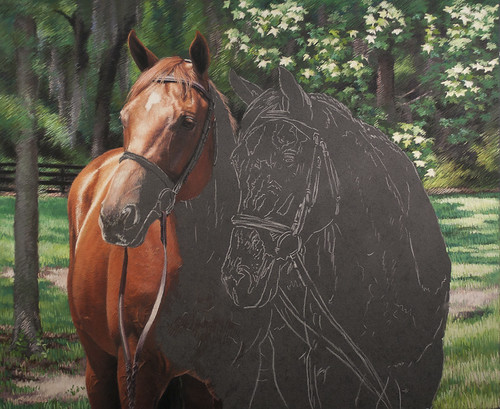
almost there!
Wednesday, December 14, 2011
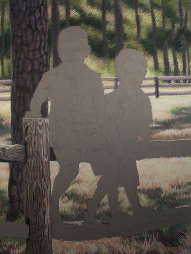
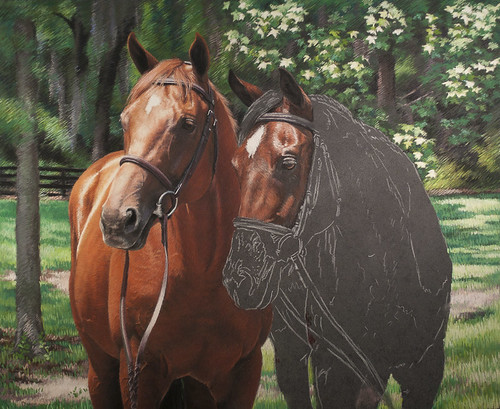
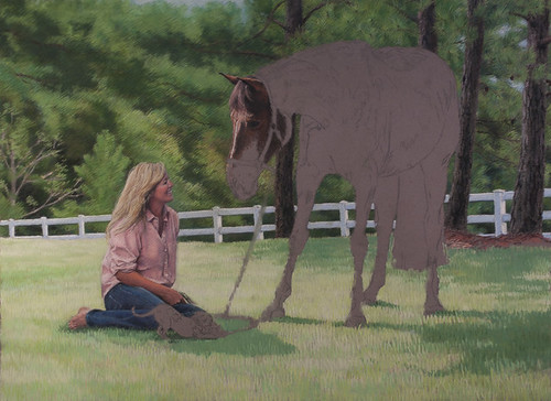
Garrett & Jacob #5

 pastel on clairefontaine pastelmat
private collection
actual size 19"X26"
http:www.djfitzgerald.com
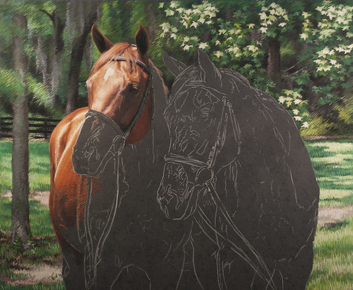
Toes! I love to work on toes! They can be hard, but they almost always come out great! I don't know if I mentioned this before, but I love the way the grass came out around the bottom of the piece. It was really fun pushing the pastel around on this surface! I am going to try to add some close ups of the toes on this blog. If I don't figure it out (!!) I will just put them on the next post!
Yeah! I did it!
Friday, December 9, 2011
Garrett & Jacob #4
pastel on clairefontaine pastelmat
private collection
actual size 19"X26"
http://www.djfitzgerald.com
Wednesday, December 7, 2011
Garrett & Jacob #3
pastel on clairefontaine pastelmat
private collection
actual size 19"X26"
http:www.djfitzgerald.com
I always try to work on the faces first... and then I play with them as I finish the rest of the pastel. So far so good!
private collection
actual size 19"X26"
http:www.djfitzgerald.com
I always try to work on the faces first... and then I play with them as I finish the rest of the pastel. So far so good!
Tuesday, December 6, 2011
Garrett & Jacob #2
pastel on clairefontaine pastelmat
private collection
actual size 19"X26"
http:www.djfitzgerald.com
Thursday, December 1, 2011
New pastel! Garrett & Jacob #1
pastel on clairefontaine pastelmat
private collection
actual size 19"X26"
http:www.djfitzgerald.com
New commission! Two very cute little boys! I did their mother's portrait when she was a teen with a couple of her horses. I love doing the next generations... although if I think about it too much it makes me feel a little "dated"!!
This portrait is being acomplished with lots of photos... Jacob (the youngest) was a typical 3 year old and definitely not into the a photo session. So we had to work around what he wanted to do... and climbing on the fence was not one of them!! Got about 2 shots of him on the fence but not one smile! But I got this really great shot of Garrett and I love the light and the background. Luckily I found another shot of Jacob's face that had the same lighting and angle so I could make it work. So far I love the way the background has come along... I especially love the grasses in the lower left corner... it felt more like painting! This is also the first time I have used this paper (Clairefontaine pastelmat) for a classic portrait and with out dry mounting. I am doing this by taping the paper all the way around with painters tape. Not crazy about the way the middle wants to puff up. Not quite sure how to remedy this. Right now I just use my left hand to push down the paper so I can work on the firm surface.
Sunday, November 27, 2011
Frances Boys Pastel #9
pastel on pastelmat
private collection
actual size 18"X22"
www.djfitzgerald.com
Done! Signed, sealed and delivered! Literally!! This was for a local friend/client... so I did not have to ship it! She loved it! Actually after I took this photo I went back and nit-picked it some more... mostly the bay horse's chest area... it was not very distinct in the photo. And I think I have it a little too yellow brown instead of a reddish brown... But that is just me! Also played with the tree on the left some and the background in general.
I think I like this paper... it has its good points and a few bad points. Good points... the color quality is wonderful. I love that I can use pastel pencils on it. The quality of line is also good. One draw back is that I have to be careful not to load the paper up too much.... then I lose that wonderful line quality. And it smudges rather easily... even with spraying with a fixative. But the pastel does not seem to come off...
My next project is of two little boys on a fence. It will be the first one I will be doing without dry mounting.... and it is the first one of people on this surface.
Hope everyone had a wonderful Thanksgiving!
Wednesday, November 23, 2011
Frances Boys Pastel #8
pastel on clairefontaine pastelmat
private collection
actual size 19"X26"
http:www.djfitzgerald.com
Almost there....
Happy Thanksgiving!!!
Friday, November 18, 2011
Frances Boys Pastel #7
pastel on pastelmat
private collection
actual size 18"X22"
www.djfitzgerald.com
I am still enjoying this paper!!! It is better if I can stay fresh with my pastels. Which is a little hard for me when doing horses... especially the chest and neck areas. I like to build up the pastels for that richness that I like so much. And when those areas are shadowed it is that much harder.
Wednesday, November 16, 2011
Frances Boys Pastel #6
pastel on pastelmat
private collection
actual size 18"X22"
http://www.djfitzgerald.com
The chestnut horse is pretty much done... but I will go back and touch up some things in the end. Right now I can see that I need to work on the left side of his neck some more... it pops out instead of going back. And I want to go back and work on both of his forearms... the black is a little too intense. Some of that is the photograph. But it needs to be toned down a notch. Now working on the bay horse....
Tuesday, November 15, 2011
Frances' Boys Pastel #5
pastel on pastelmat
private collection
actual size 18"X22"
www.djfitzgerald.com
Almost done with the chestnut... still working on his neck and chest.
Monday, November 14, 2011
Frances' Boys Pastel #4
pastel on pastelmat
private collection
actual size 18"X22"
www,djfitzgerald.com
Love the way the reins turned out. In the original photo Frances is holding the reins up. I had to go into the memory banks for the million of times I have painted or done reins in pastel to come up with these. I will be doing that for the bay horse too!
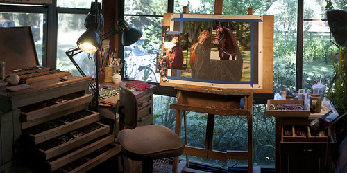
Studio Work Area Panorama
This is a panorama of my work area. A little cozy! But then I don't have to reach very far for anything! and I have a lot of surfaces to lay pastels on.
Saturday, November 12, 2011
Frances' Boys Pastel #3
pastel on pastelmat
private collection
actual size 18"X22"
http://www.djfitzgerald.com
.....
Thursday, November 10, 2011
Frances' Boys Pastel #2
pastel on Clairefontaine Pastelmat
private collection
actual size 18"X22"
www.djfitzgerald.com
Coming along nicely.... This paper does take some getting used to. The pastel just looks different on it. And I am finding that with the horses, I tend to use more of my pastel pencils.
Monday, November 7, 2011
Frances' Boys Pastel #1
pastel on pastelmat
private collection
actual size 18"X22"
http://www.djfitzgerald.com
This is another pastel progression that I am doing on Clairfontaine pastelmat. The size is 18"X22". I actually started this one on a piece of velour board. But I so enjoyed my last project on the pastelmat, that I started this one over on the other sheet that I had unfortunately dry mounted... evidently a big NO NO! I just got an order of 5 large sheets of the pastelmat after I had already started this piece. The other wonderful thing about this paper is that it comes in a larger size 29"X40"! I have a portrait commission coming up soon for 6 horses! I will need that larger size! This is also the first time I have worked on a surface this dark. I had to use a white pastel pencil for the drawing. I will have to get a white lead pencil... the pastel is just a little too soft for drawing details.
Oh, and the Frances of "Frances' Boys Pastel" is the women riding the horse in the oil painting in the header of my blog!
Saturday, November 5, 2011
Susie, Uranda, & Stella #8
pastel on pastelmat
private collection
actual size 19"X26"
http://www,djfitzgerald.com
It is done. Have have shown it to the client and they ordered a giclee! Very happy about this! I was kind of nervous because of the new paper and having so many photos to work from. The photo of Susie was taken 2 years ago with a different horse and dog. They decides to change both the horse and dog! I took the photos of the Uranda last march. And Stella was from a photo Susie took from her cell phone! They tragically lost Stella and she really wanted to have her in it. Luckily it all worked out! I love it when it all comes together! I really enjoyed this paper although it took some time to get used to. I am looking forward to doing another project on it without dry mounting. Hoping I will like it that much more! I think I ended up with a layer or two less by dry mounting it. I have sprayed it with fix and banged it around a little to make sure that the pastel is not going to fall off!!! It does smudge quite easily though. Actually as I am typing this I see something I need to touch up... the pine straw under the pine trees on the right needs to be toned down some! :)
Friday, November 4, 2011
Susie, Uranda & Stella #7
pastel on pastelmat
private collection
actual size 19"X26"
www,djfitzgerald.com
Almost there... I still have to go back and work on Uranda's coloring... I have her a little too red. And of course I have to do Stella and the shank. I think I also want to tuck in Susie's shirt a bit more... I already did some in the front... maybe a little more in the back. Also need to work on the grass and shadows.
Tuesday, November 1, 2011
Susie, Uranda & Stella #6
pastel on pastelmat
private collection
actual size 19"X26"
http://www,djfitzgerald.com
Working on Uranda... it is a little rough right now... just takes time and lots of pastel to get the richness I want in her coat. Horses in shadow are really difficult. It is very easy to get flat. Shadows are so many different colors and they are all very subtle.
Monday, October 31, 2011
Susie, Uranda & Stella #5
pastel on pastelmat
private collection
actual size 19"X26"
http://www,djfitzgerald.com
I have Susie pretty much the way I want her. I think I will go back and take in her shirt some more in the back. I did the front... maybe a little more there too. Uranda is coming along well. Her neck is going to be a lot of work to get that richness that I like. The color is different on this surface... takes a little getting used to. I think I want to to try doing a little underpainting with this paper in the future... I think I will research it some first...
Sunday, October 30, 2011
Susie, Uranda & Stella #4
pastel on pastelmat
private collection
actual size 19"X26"
http://www,djfitzgerald.com
Moving right along! I will go back and "clean" things up a bit later... but I do like the contrast between the softness of Susie's face and the coarseness of her shirt. And as I am looking at it now... I think I need to take her shirt in a little. It is a bit blousie and I have a good feeling that she will not be happy. Susie is a professional rider and is definitely not fat. In my 25 years of doing portraits it is always a good idea to make everyone a little thinner... men too! And almost everyone requests it. And interestingly enough, its the thinnest people that usually request it up front! I have actually had people bring back portraits months after they had received them, to make them look thinner! One women actually lost weight a year after the portrait was completed and requested that I change the portrait to make her even thinner! Had the portrait shipped all the way from Puerto Rico just to have it changed. On pastels it really depends on the piece as to whether I can do it or not. In that case I could, and did. I did not charge her... I want people to be happy with their portraits. In the end, they are going to be living with them hopefully for the rest of their lives. I want them to be a remembrance of a wonderful time in their lives.
Saturday, October 29, 2011
Susie, Uranda & Stella #3

pastel on pastelmat
private collection
actual size 19"X26"
http://www,djfitzgerald.com
One of the things I am loving with this paper is the ability to make fine details. I am using pastel pencils more here while working on Susie's face... so much easier than having to keep pastel sticks sharp. And I have such a large collection of pencils that I really have not been able to use on the suede or velour... they just have more punch on this surface. This profile would have been so much more difficult on the velour/suede surface. And again I am using my kneadable eraser for blending... such a great little tool! Depending on how I use it it can either erase or blend. I have even used it to add color to a tight spot. It is also great for working the edges of color.
Wednesday, October 26, 2011
Susie, Uranda & Stella #2
pastel on pastelmat
private collection
actual size 19"X26"
http://www,djfitzgerald.com
I am really enjoying this paper!!! The colors just seem more alive! Although I think I have over worked the upper left side of the back ground. I get some flaking when I work it. But when I shake the piece, nothing comes off! It is so very interesting... as I work the pastel the flakes that do come off stick to the open surface... very neat paper. I think I have found my surface! I just have to be careful not to overwork. But I have also found that I can literally brush off unwanted pastel. I am using a sponge covered blending tool and a kneadable eraser for blending. I love the kneadable eraser... I can form it into any shape I want for blending in tight areas. I am also experimenting with a little battery powered mechanical eraser. Kind of fun!! I can get some nice lines with it.
Monday, October 24, 2011
Susie, Uranda & Stella #1
pastel on pastelmat
private collection
actual size 19"X26"
http://www.djfitzgerald.com
This is a pastel progression on Clairefontaine pastelmat. A new surface for me. And I already made a big boo-boo! I had it dry mounted... which I do with almost all papers I work on... just makes them easier to work on and to ship. Plus, I would rather have the process done before I work on the piece rather than after. If the client's framer dry mounts the piece, it could smear... I don't want to have to go back and repair my work if at all possible. Anyway, I noticed a little change in the texture and the coloring of the paper when I was doing the drawing... so I did a little research and found that dry mounting is NOT recommended! I really don't know why they do not put some sort of notice with the paper when you buy it. Evidently the heat does something to the surface... well I decided to work on it anyway since I was well in to the piece by now. And I don't know how it should feel anyway! So far I am really liking the surface... the color seems more vibrant and it is taking a lot of pastels and pastel pencils that I have never been able to use on velour or suede. I figure it will only get better when I do it on the paper with out the dry mounting!
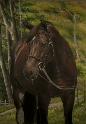
Friday, October 21, 2011
Danny & Ron's Rescue calendar cover
Danny & Ron's Rescue calendar cover
gouache on Ampersand watercolor panel
actual size 16"X22"
property of Danny and Ron's Rescue
Well it is that time of year again... time for the calendar cover! This is the third cover I have done for my good friends Ron Danta and Danny Robertshaw. They have this amazing dog rescue operation.... because of them, 3372 dogs have found homes so far! They are 2 of my most favorite people in the world! And this is the least I can do for them! The calendar is coming out the first of November. If you would like to order one, go to their web site...
http://www.dannyandronsrescue.com
Even if you don't want a calendar, go and visit their site! Next year we are going to go back to my idea of having a different artist do a dog's portrait for each month... but we are going to start earlier in the year!!
This one was quite the challenge! We used this wagon that was on display at a horse show. It is a little bigger than I really wanted... I had envisioned a pony cart. By using this one, the painting got really big! I even made the wagon and the horses (which I had photographed years ago at a driving competition here in Ocala) a little smaller. Otherwise the whole painting would have been about the horses and wagon. I started it on a smaller board and quickly chucked it and ran to the nearest art store for a larger one! There was just no way that I would have been able to get details on Ron and Danny at that size. I could actually have played with this a while longer (as always!)... but we were already way past our deadline! NEXT YEAR... I will start earlier! Of course I say that every year! :)
Monday, October 17, 2011
Sienna
Oil on Ampersand artist panel
private collection
actual size 11"X14"
http://www.djfitzgerald.com
This was a really fun piece and smaller than I usually do. I also have never painted on a panel. This one has a canvas texture to it. I really enjoyed the firm surface! It was nice to not bounce on the canvas when I push the paint around! I also used a retouch varnish while working on it.... I always spray with retouch varnish to protect the piece until the client has a permanent varnish applied (paint takes 6 months to cure before you should apply varnish). Some of the colors tend to dry and look totally different. Spraying the painting makes the paint look wet again. And I enjoyed working on the slick surface... I think I have to try a smooth panel for my next painting!
Tuesday, October 11, 2011
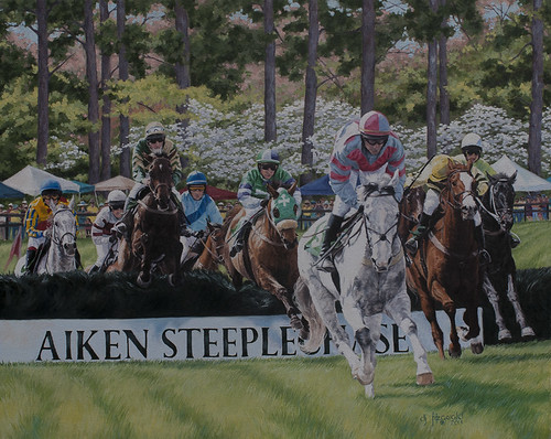
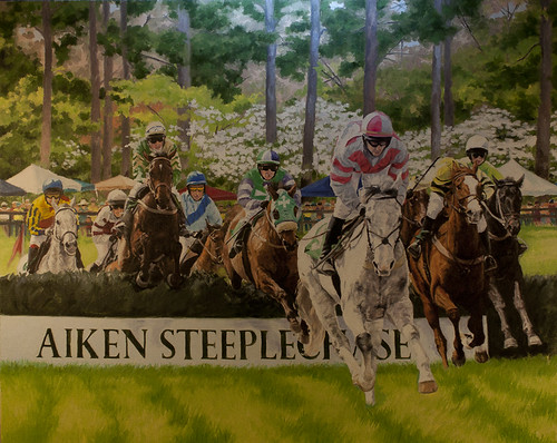
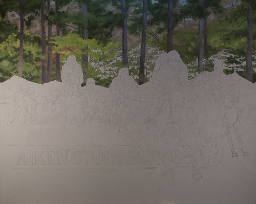
Aiken Steeplechase 2012 final!
oil on canvas
artist collection
actual size 24"X30"
http://www.djfitzgerald.com
http://debifitzart.blogspot.com/
This is a better pic... I took it outdoors. The day was slightly overcast... so I did not have to deal with any glare on the paint. I also sprayed it with a re-touch varnish. The rule is not to varnish for at least 6 months. The retouch varnish will protect it until then and it also bring the paint up to all one gloss. I just love the way that looks... it almost looks like the paint is floating on the canvas... my favorite part!!! I spend a lot of time "nit picking" my paintings... this one is no exception! In fact it should be the text book!. So much going on! Not really much painting, but a lot of stepping back and looking, then going back and touching up this and that. I have also found taking photos very useful. When I put them on my desktop, I see things that I might have missed. Before the computer entered my life I would put the paintings on the mantel in the living room and live with them for a while. I don't really have the luxury of all the time for that these days! One of my first (and favorite!) professors in college once said that the judge of a good work of art is to be able to sit with it across from your favorite chair for a long period of time!
Sunday, October 2, 2011
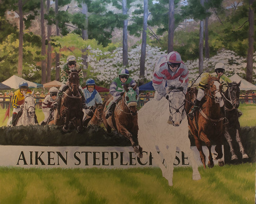
Aiken Steeplechase #10
oil on canvas
artist collection
actual size 24"X30"
http://www.djfitzgerald.com
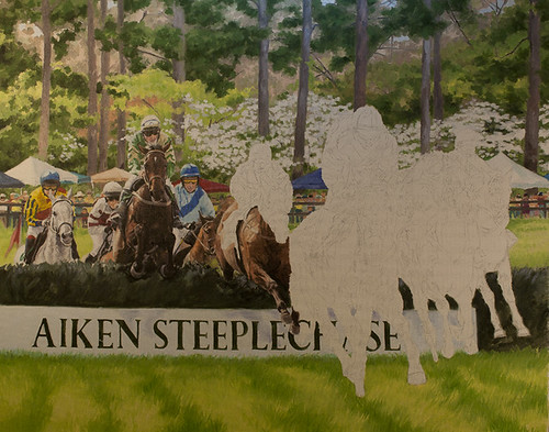
This is really a bad photo.... the light on the left is way too close and I have a glare. When I am doing these progressions I don't really take the time to get good photos. I shoot them right on the easel with the lights I work under... so the piece comes out a little on the yellow side. I will take it outside for the last photo.... it will be a little closer to the actual painting. At this point, I have been working on the jockeys. I will move on to the horses next, then the background again (those dogwoods!).... almost finished. I can "nit pick" these for ever.... you really will not be ale to see that much difference in the photos. So my next photo will be the final.

artist collection
actual size 24"X30"
http://www.djfitzgerald.com
This is really a bad photo.... the light on the left is way too close and I have a glare. When I am doing these progressions I don't really take the time to get good photos. I shoot them right on the easel with the lights I work under... so the piece comes out a little on the yellow side. I will take it outside for the last photo.... it will be a little closer to the actual painting. At this point, I have been working on the jockeys. I will move on to the horses next, then the background again (those dogwoods!).... almost finished. I can "nit pick" these for ever.... you really will not be ale to see that much difference in the photos. So my next photo will be the final.
Wednesday, September 28, 2011
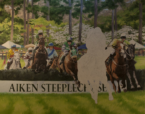
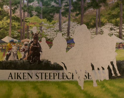
Aiken Steeplechase #9
oil on canvas
artist collection
actual size 24"X30"
http://www.djfitzgerald.com
Worked on the background and grass in the foreground. I always work more on the backgrounds than anything else! Grass has always driven me crazy... it is almost like doing an abstract painting with in a realistic painting! I want it to look interesting up close as well as when you back up. So I play with color and brush strokes to make it more interesting... besides, the grass is more than just green! The dogwoods in the background are going to need more attention.... I don't want them to pop forward so much or to become flat. Also worked on the crowd and tents some. And the banner and brush box. In the photos the brush box is almost a black... I choose to make it a very dark green. I like the way the brush box looks. But I will still add a little more pain to it... make it a little richer... not so flat.
Monday, September 26, 2011
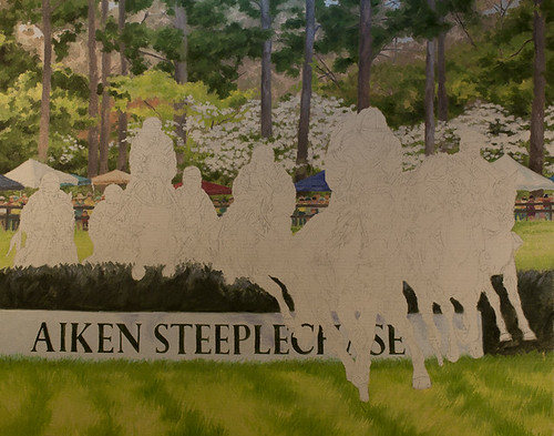
Aiken Steeplechase #8
oil on canvas
property of the artist
actual size 24"X30"
www.djfitzgerald.com
Yeah! All the first layer is on! Now to fix everything!!
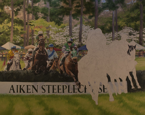
Saturday, September 24, 2011
Aiken Steeplechase #7
Oil on canvas
property of the artist
actual size 24"X30"
www.djfitzgerald.com
Getting there with the first layer... I am quite happy with the way it is coming along! Of course the last horse is going to be the most work... I really want him/her to stand out from the rest. Being a light gray, I figured would help... that and the hot pink jockey silks. The difficulty in painting gray horses, especially when they have the sun on them like this one, is that the shapes of those "hot" spots becomes all that more important. The dapples can really confuse you! So I have to pay a little more attention to this one... besides the fact that he/she is the focal point!
Thursday, September 22, 2011
Aiken Steeplechase #6
Down to the last horse... of course it is the most important one! I want him to look like he is coming right at the viewer.
Sunday, September 18, 2011
Friday, September 16, 2011
Studio Project...
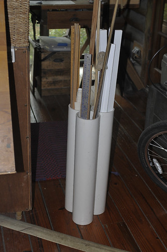
Thought I would mix it up and add another one of my favorite "studio inventions"! I always have tall stuff with no place of their own. Usually stuffed in corners or behind shelves. And they always want to fall out of their places. So, I came up with this idea... bought the biggest piece of pvc I could get at Lowes. Cut it into 3 pieces and put caps on the bottom. Bolted them together... and WALA.... I want to go to a plumbing supply store and get a bigger piece and do another one.
Thursday, September 15, 2011
Aiken Steeplechase #4
This is the fun part... watching the horses emerge from the painting! It is coming right along now. One thing I wanted to bring up.... believe it or not, I do not use "brown" paint! I have gotten to where I love to make my browns out of oranges, purples and pinks. Some yellows too. I just get a richer color than using good old burnt umber. I started doing this when I got frustrated with the way burnt sienna and burnt umber dried... it never looked as good as when it was wet. And I rarely use black from a tube... for the same reason... looks flat when dry. Not to mention that there isn't that much in nature that is truely black. Depending on where it is going, I use a combination of paynes gray (I use a lot of Paynes gray!), and some sort of red... usually a mars red or violet. I also love brown madder aliz with paynes gray. I had a teacher once that recommended burnt sienna and prussian blue for a rich black. I just do a variation of that. You can get some really beautiful colors when you add a little pink or white to a mixed black. Makes my high lights more realistic. Basically I go back to the color wheels/charts I made back in college art school... they have really come in handy!
Tuesday, September 13, 2011
Aiken Steeplechase #3
Working on the horses.... I always start from the back and work forward. I also put in a lot of details in the first layer. I used to just do a quick wash of general color first... but I am not a patient person! I just can't wait to see the painting emerge. So, now I skip that first layer! I was not taught to paint this way. But you know, it's my painting! This layer takes a little longer to do, but it is much more rewarding in the end.
Sunday, September 11, 2011
Aiken Steeplechase #2
Second day.... Still working on the back ground. The jump had a banner for an Aiken bank... I guess I could have put it in... maybe the bank would have purchased the painting if I had!!! But this is suppose to be for the Aiken Triple Crown... so I decided to go with that. Not so good with lettering... I was always the one everyone would go to for making posters as a kid... because I was artistic... but I have never been really good at lettering. There is definitely an "art" to it. I probably just don't have the patience for it. But I am happy with this so far. And the crowd was a new experience for me. I sort of made them up as I went along. I don't want you to really look at them anyway... just to know they are there for the event. I do like the colorful band that runs horizontally through the painting... the tents, crowd and jockey silks. I think it is fun! And that is what I think the whole event is!
Friday, September 9, 2011
Aiken Steeplechase Painting
oil on canvas
artist collection
actual size 24"X30"
www.djfitzgerald.com
This is the first installment of another painting progression. I was contacted last spring about doing the art work for the Aiken Triple Crown poster. The triple crown is a big deal in Aiken. I was asked to primarily feature the steeplechase event. The other 2 weekends are a polo match and a flat race day. I attended last spring to take photos and get a feel for the event. It is very festive! Everyone (practically all of Aiken!) brings in pop up tents and lots of food and decorations. And everyone dresses up... lots of big hats! Unfortunately it rained off and on all that day... so my photos were nothing to write home about. I have ended up doing a compilation of photos for the painting. And after looking at the last 5 or 6 years of posters I realized no one has done a big typical jump piece... which I thought was a little odd... but fine by me! So this is what I am doing! Luckily this year for whatever reason, the dogwoods were in bloom... evidently this is not normal. They usually bloom just after or just before. So I did get some good back ground material. Of course this is due right now (!!!) Typical me! So I am going to try to do this fast... at least for a 24"X30" oil painting! But at least I don't have to worry about getting a horse or rider just so. I really plan to have fun with it. I decided to do it 24"X30" because I found a great frame @ my framer's (Rogers Frame Shop in Ocala)... it is a leather frame, (which I love!) that had been damaged. So I got it at a great price. And Roger will touch up the little bit of damage. But I had been waiting for just the right piece to do it justice!
Thursday, September 8, 2011
Studio Project
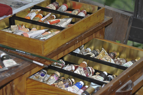
And for my next project... I lined my paint drawers with aluminum flashing. A wonderful friend (Jim Simms) long ago made this for me when I graduated from college. It has held lots of stuff over the years. But I really like having my oil paints in these drawers. There are two drawers. The second drawer has a sliding pull out tray (seen sitting on the top of the cabinet) Anyone that uses oil paints know that they always leak and get gooey. A first I lined them with aluminum foil... did not work! So I decided to try aluminum flashing. I made templates of the bottom and sides of each compartment. Cut the flashing... which was easier than I expected. Then I taped the edges together with "Gorilla Tape" ( A super sticky duct tape) this will hopefully keep me from slicing my fingers and keep the sides in place. So far this job worked out pretty well... but I did mange to cut my index finger... right thru the nail! ouch! As my husband said... it was inevitable! When ever I start cutting stuff.... At least it is on my left hand! And Neosporin is my friend!! Great stuff! It is healing nicely!
Sunday, September 4, 2011
Studio Project
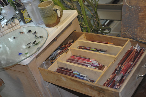
one of my latest projects... I added the partitions in this drawer for all my pastel pencils. Of course I thought it was going to be easy... isn't that just the kiss of death!!! I had it all done... and the drawer would not close!! I really hate it when that happens! I had to put a couple of notches in so that the little guide thingie could pass!
Thursday, September 1, 2011
Danny and Ron Rescue new logo

gouache
property of Danny and Ron Rescue
http://www.dannyandronsrescue.com
This is the new art work that I have created for Danny and Ron's rescue. They will use it on their web site and for their stationary, tee shirts, etc..
I took the photo of the puppies while in Camden last spring. I was there to shoot pics for the 2012 calendar (which I really need to start working on!!). The puppies were all from the same liter and looked more like the two puppies closest to the little boy. I changed the other two to more resemble some of the other types of dogs Ron and Danny rescue. I took the photos of the little boy last summer at Blowing Rock while shooting photos for some clients at a horse show. He was actually looking at a caterpillar in some flowers! I knew I could use it in something like this!
Here is a little story on Ron and Danny... just to give you an idea of what they are like... They went on a much needed vacation in the Virgin Islands about a month ago. It had been years since they just went away where it had nothing to do with family or horses. While they were in paradise they found time to locate the humane shelter and adopted two dogs that they could bring back with them on the plane! It is just what they do!
These guys are truly amazing... they have found homes for over 3300 dogs to date! Doing my art for them is the very least I can do to help. If anyone is interested in their cause, go to... www.dannyandronsrescue.com
Tuesday, August 23, 2011
Frodo Sage & Sadie
pastel on le carte pastel paper
private collection
actual size 25.5"X19.5"
www.djfitzgerald.com
This is the first time I have tried the le carte pastel paper. I had it mounted on matte board for stability. I almost always have my papers mounted before I work on them... I figure the framer is going to have to mount the piece for framing, so I might as well do it. It makes it easier to work on and ship. And I don't have to worry about it coming back because it was smeared in the mounting process. As for the le carte paper... I liked it for this piece... all the white was a pain. But I like the way I could get more detail in the dogs, being as small as they are here. I think I like the le carte board better... but I don't think I can get it in the bigger size. It has a little bit stickier surface, which I found interesting.
I have just ordered 2 new pastel surfaces... one is a velour board made by Hamuhle. This is my last try with velour! The other is one I am a little excited about... Clairefountaine pastelmat card. All the reviews were extremely positive... including a couple that were ready to give up on pastels until they tried this surface. There was also 2 really nice portraits as examples. I am really excited to try this one... just have to figure out which piece to do on it first!
I hand delivered this portrait to the client on my way up to Tn. for a family reunion in the Smokey Mts.. The client was very happy with the piece and I had a great time at the reunion. I will post some pics from the mountains soon. I drove home a long the Blue Ridge Pky.... one of my favorite things to do. I discovered another craft center on this trip. I love looking at appalachian hand crafts. I have decided I want to take up whittling... in my spare time of course!!
Friday, August 12, 2011
Usher Portrait #7
Pastel on suede matt board
actual size 20"X26"
artists collection
http://www.djfitzgerald.com
Almost done and the client tells me she really wants the portrait horizontal... After pulling my hair a little and screaming into a pillow, I will do it over horizontally. So this portrait is now part of my collection. I could be a stinker and just give this to her and move on. But I really want my clients to be happy... so many of my commissions are from personal referrals. I really can not afford (especially in this market) to have some one unhappy. I am going to put this aside for awhile to work on a few portraits to catch up economically and then do it over... I will also change the back ground to something else from Blowing Rock... they are known for their flower borders. I have some photos of a fence line next to a warm up area with lots of black-eyed susans. The yellow will be very pretty with Usher's dark bay coloring. This is a lesson to me to be a lot more specific with the clients and to write it down! I usually do this, but this was a spontaneous commission for a return client.... lesson learned the hard way! In over 25 years I have never had to do artist/client contracts... maybe this is a time to start.
Sunday, August 7, 2011
UsherPortrait #6
pastel on suede
actual size 20"X26"
private collection
www.djfitzgerald.com
Sorry I have not been posting... I got to go to my Fitzgerald family reunion. It was held in the Gatlinburg, Tn. area of the Smokey Mountains. Had a great time! I have not seen my cousins in over 20 years! And it is amazing how we all just picked up like the 20 years were 2 years instead! I also had a few photo shoots... one in Blowing Rock, NC, and one in Flat Rock, NC.. I delivered a portrait on my way up to Tenn.. I will post that one a little later. I got some really good shots of a bear that was a frequent visiter to the cabin! My cousin Mike got a great short video of 4 bear cubs and mother playing. Of course my camera at that time was in the car!! Could not get to the car because of the bears!! After they left, I got my camera out and ready.. and of course they did not come back! One lone male came by a few times... got some nice shots of him. But he was not nearly as much fun as the cubs! I will post some pics later today... still have to process them.
Wednesday, July 27, 2011
Usher Portrait #5
pastel on suede
artists collection
actual size 20"X26"
http://www.djfitzgerald.com
and a little bit more...
Subscribe to:
Posts (Atom)